


We all know someone (heck, some of you might be that person) who is annoyingly effortless. You spend 2 hours getting ready for a night out with a friend trying to avoid looking like you crawled out of a dumpster, and just when you start feeling a little good about your vibe, nonchalantly catching glances of yourself in your rearview mirror on the drive over, you get to your meet up spot and realize you look like the Hamburglar compared to that person. How do they do it? Are your genes that much more garbage than theirs (thanks, mom)? Maybe she’s born with it, maybe it’s actually Maybelline? I’m not here to tell you how they do it, but what I am here to report is that your friend—the one who makes you think they just threw on some ol’ thing, tousled their hair and swiped on some Chapstick—is lying to you. Well, that is if your friend was a neutral room. THAT WAS A STRETCH, HUH? But for real, they relate. Keep reading, folks, because it’s about to get helpful.
Neutral/beige rooms aren’t as “effortless” as they look. In fact, they’re kind of an oxymoron in that most people go this route because it’s “easy”…beige goes with beige, after all, right? It’s not necessarily a difficult feat, but it’s not as simple as just buying everything in the same shade of off-white. There’s a reason beige gets a bad rap and is synonymous with lackluster or uninspired rooms. B is for beige…is for boring. Really good neutral rooms all share similar qualities, including the right balance of texture, tones and a sprinkling of je ne sais quoi (we’re about to dive deeper into all of that, promise).
In fact, when done right, it feels nearly masterful. I’m all for color, but some hue-deficient rooms are done so well that they can take your breath away. You envision what it would be like to live in a home that’s so visually light…I mean, just look at Mel’s previous apartment up there. She couldn’t possibly ever have a bad day in there right? Never once did she argue with her mom about posting a well-intentioned super unflattering photo of her on Facebook. In a room like this, bad photos don’t exist, so said fight would NEVER happen to begin with…
Let’s jump to the “tip” and “educate” portion of this blog post before I start making other unnecessary comparisons, shall we? So, the seven talking points to follow are key elements we pulled out of studying dozens and dozens of photos of successful neutral rooms.
1. Varied wood tones

You’re going to notice that a common thread in all the rooms we’re showing you is variety, be that in tones of textiles, finishes and, for this point, wood. Successful neutral rooms need depth and complexity to be special, so picking everything in a matchy-matchy shade will fall flat (unless you have some other factors, which we’ll get into). Here, in this room I wish I could move right into at the very least for a long weekend, you’ll notice that there are both deeper rich tones (like the sweet chair in the background), middle shades from the coffee table, trays and rattan armchair, and some lighter finishes via the bench holding up the art.
2. Mixed shades of beige, white and other neutrals

Remember that time (45 seconds ago, depending on how fast you read) I mentioned varied tones of basically everything is crucial to a good neutral room? I was serious. This room by M. Elle works so well because of the subtle variations. The walls are a nice crisp white, then a few shades down are the sofa and armchair in a nice creamy hue. The wood tones of the shelving, coffee table and floors are all pretty similar (all which add some really nice warmth), but are separated by the toffee rug. Once that foundation is set, it’s easy to layer in all the extras that bring in some life (pillows, trays, decor, curtains, art…), and kept in a quiet palette, they just perfectly meld into the scheme like butter on a warm biscuit. It’s like the “no makeup” makeup look of interior design.
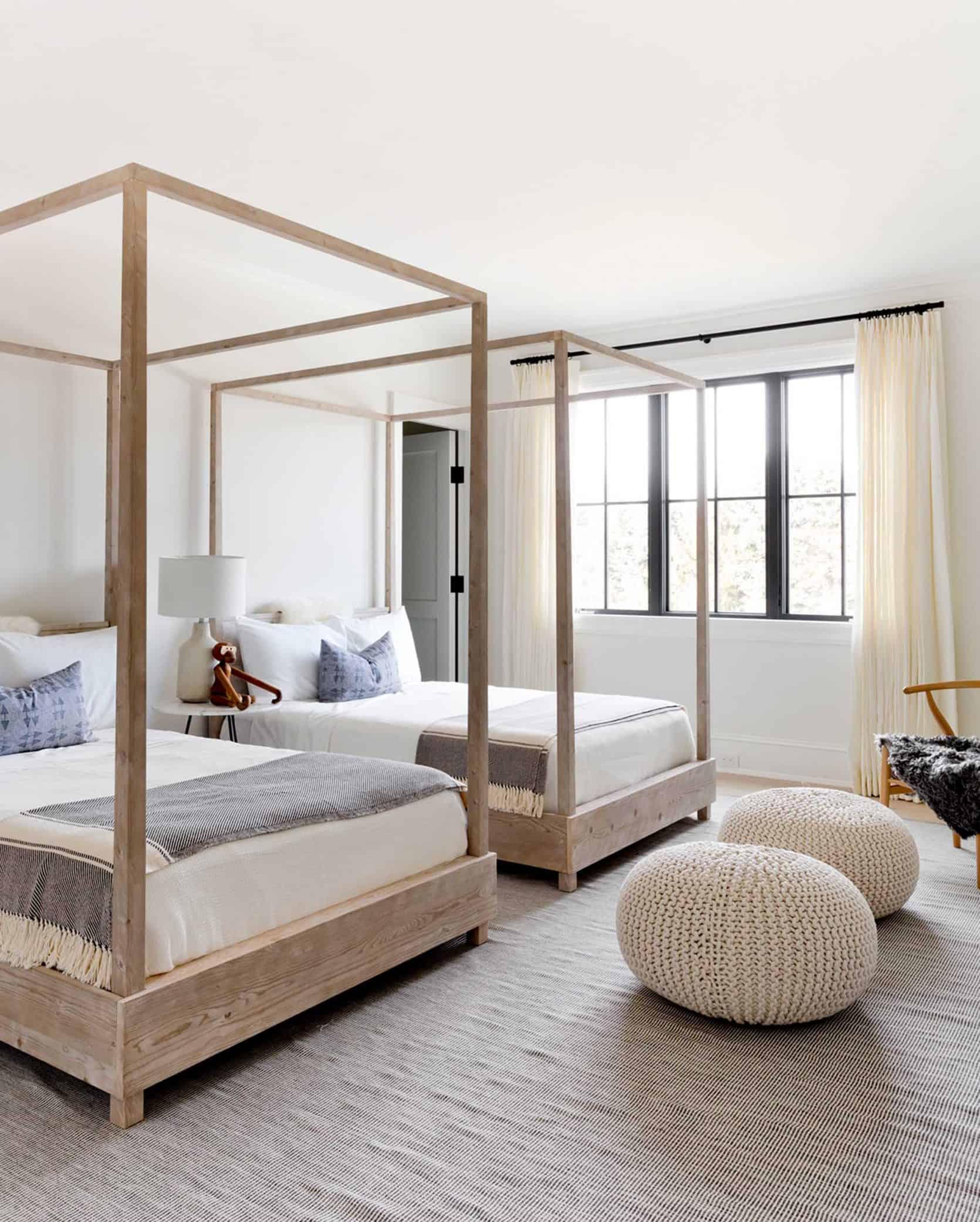
The varied hues don’t even have to be that severely different, as showcased in this bedroom. The walls and bedding are a bit brighter than those buttery curtains that are just barely a shade lighter than the knit poufs, which are a touch lighter than the rug (it just has darker stripes throughout that tricks the eye a little).
3. A touch of black or metallic (or both)

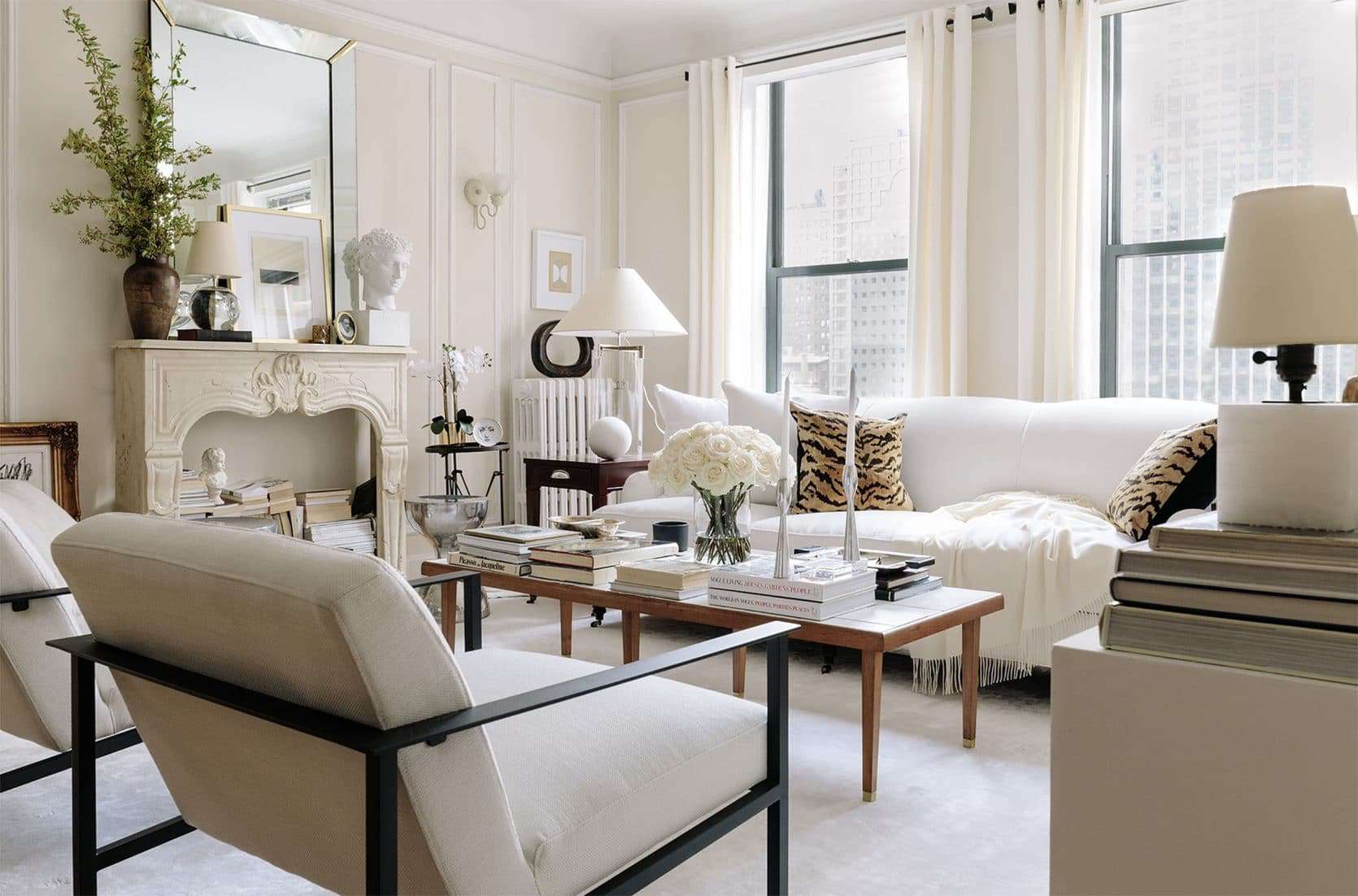
Look, a touch of black will ALWAYS be a welcomed addition to a room. It’s grounding, adds depth, draws the eye…it’s interior design panacea, and it absolutely has a place in a mostly beige room for all the same reasons. Here, in a room by Alyssa Kapito that feels like a deep breath personified, the painted black fireplace surround, the…tooth (??) stools and the peppering of matte black via lamps and vases help the eye to move around the rather one-note cream colors.

The home of Erin Fetherston has always given me palpitations. Mostly because it’s the type of room I could likely never put together because I swear up and down I only want to live in a home with lots of patterns and colors, but then in my heart of hearts, I realize maybe I don’t want that at all? I’m a very complex person who knows nothing about her own true desires. Actually, I’m polyamorous when it comes to interior design and would gladly take many aesthetic “wives” if I could, BUT back to why this room works. It has a lot of the elements we’ve already talked about (and will talk about): varied wood tones, texture, a touch of pattern and, last but not least a bit of black and brass. These provide much-needed contrast and tension in an otherwise quiet room and this is CRUCIAL to neutral spaces. Do I need to say it louder for the seats in the back? Write this one down.

The same thing goes for this room in a home by Tamara Magel. The addition of the black door frames, pillows, coffee table frame and aged brass chandelier and sconces really add such richness and depth that would otherwise be absent here.
4. Interesting shapes and silhouettes

Sure, this room screams I HAVE A TON OF EXPENDABLE INCOME TO BUY CUSTOM AND DESIGNER FURNISHINGS…AND SHEEP! But there are still everyday lessons to be pulled from the Berlin home of Emmanuel de Bayser. When your palette is this pared down, something has to provide visual intrigue. In this case, it’s the rounded and sculptural seating as well as that sinuous coffee table that makes your eyes buzz. It’s like a DING DING DING, this room is interesting. Now, you don’t need an entire room full of insanely expensive furniture, but try to bring in at least two or three things that break the monotony a bit, whether it’s a funky armchair or a super special grouping of side tables.

While that last room was basically a work of art, this shot proves that you really need just a handful of “interesting” items to bring a neutral room to life. Here, that knot pillow, the zig-zaggy sconce and the rustic milking stool take a simple vignette to the next level.
5. Tons of texture

When Brady refreshed his living room last year, he went way more beige and neutral than in his previous reveal. He kept it interesting by bringing in so much texture via the rug (which was already there), slipcovered sofa, and that chunky knit throw and pillows. They’re all in relatively the same shade, but it doesn’t feel stagnant because of all the other elements (black, metallics, wood).

This is such a simple, quiet space that I’ve loved since the moment I saw it. The mix of linen, mud cloth, rattan, caning and seagrass comes together in an insanely lovely and welcoming marriage.

This is the third Tamara Magel room we’ve shown in this post, but well, she knows what she’s doing when it comes to neutrals. This shot sings because of the delicate balance of textures between the threading and wood of the dining chairs, the nubby rug, the plush animal skins (which I don’t suspect are faux, but really hope are at least vintage??), and the grain of the table top and ceilings. So quiet, yet it screams of success.
6. A subtle layer of soft color or a statement pattern (but just a little)

When you have a pretty neutral backdrop, even the littlest bit of color and pattern will sing, like the Rebecca Atwood pillow and peach throw in Samantha Gluck’s living room.
Excuse me while I have a bit of a fangirl moment over Josh Young’s Chicago apartment. It’s homes like his that make me want to cross over to the neutral side (though I know I say that but don’t fully mean it because I am who I am). There’s so much to look at here, but it doesn’t feel cluttered because of the soft, colorless palette. However, it’s those wild tiger-print pillows that take this from sophisticated and lovely to a bit edgier and…younger? Sometimes all it takes is a little out-of-the-box pattern, people.
7. Architectural interest certainly helps

And finally, we get to something that is likely quite hard to help for most people, unless you plan on moving or renovating, and that’s architectural detail. Designer Kerry Vasquez’s LA home is such an effortlessly pretty study in neutrals, but let’s get real…the domed ceilings, original fireplace tile and woodwork (which you’re not seeing in this photo, but it’s there), add that much-needed sprinkle of character. This is not to say to run out and find a new place to live should you be paying rent or a mortgage in a detail-less tract home or basic apartment, BUT if you are so lucky as to live in a home with some original detailing or spectacular moldings/built-ins/ceilings/etc., remember that that’s nearly enough to carry an entire room without having to bring in a crayon box of color.
So, that’s how you build a really fantastic neutral room. Beige can be beautiful and interesting and full of character, and hopefully now you have the treasure map to that design bounty. Oh also, we want to keep working on Design Mistakes for you guys, so please share in the comments below what specific topics that we haven’t already covered you guys want to read about. We’re an open book!
This post is making me realize that when I say “I hate beige rooms,” maybe what I mean is “I hate McMansion living rooms that have been purchased entirely at the Brick.” What a revelation! Also, Arlyn, I love your writing voice.
I almost always read anything that follows after that photo of Mel’s living room. It never gets old to me and I really enjoy the Erin Fetherston design and Tamara Magel’s too, Tamara is new to me so I’ll have to look for her other work now. Also, Arlyn’s writing is always interesting.
Love your polyamorous design “wives”, Arlyn! 🙂 I am so with you on loving multiple eras/looks/color schemes.
me, too! 🙂
These rooms are so wonderful. I’ve finally accepted the fact that I am not a person who can actually pull off rooms like these (I’m a color magpie who finds it physically impossible to buy beige things), but goshdarnit do I love the heck out of a neutral room when it all comes together just right. So soothing.
Josh Young’s mantel without a fireplace filled with books is what dreams are made of.
My thoughts exactly.
Thanks, Arlyn! I’ve never been a lover of neutrals, but you have convinced me neutral rooms can be beautiful and interesting when done right! These homes are gorgeous! It brings up some questions I have that I haven’t seen addressed on this blog.
If you do one room in all neutrals, do you need to carry that throughout your whole house? In other words, should your design style be consistent throughout your home, or can you have one room that clearly modern and another that is neutral or vintage? The homes that you feature are usually done by a designer, so their style is clearly defined and evident in every room. What if you like many styles? Do you have to pick one and stick with it for every room of your home? Are there some decorative pieces that can be introduced to each room to make them feel cohesive? I would be interested in seeing how I can do that in my house. Thanks!
Yes exactly. How to vary the “wife” of each room while still making them feel intentional and complimentary?
I think you have an eclectic style, and it’s best to carry it throughout to have a good flow and cohesion. You just need to learn how to marry the pieces and how to balance them out for a natural look
Most of the neutral rooms I see from designers tend to continue into other neutral rooms. Likely because the client requested a “quiet” and “serene” home. But there’s also something kind of nice about going from a neutral room into one awash with color. It’s like colorblocking…but with beige. Maybe being in a touch of color to make the transition less harsh.
“Keep reading, folks, because it’s about to get helpful.”
Actually lol-ed. And yes— this WAS helpful! Now off to find a touch of black for my living room…
Thank you, I love this! As I get older my tastes move way more toward neutral (I’m following Emily’s trajectory only I’m not going back to the OG weird this year, haha). One thing that I struggle with… I look at all of these rooms and love the multi tones of beiges and whites. But in my own bathroom, a vanity that was labeled “white” on the website actually showed up a fairly yellowed “almond”, and it looks AWFUL with all of the white tile I have in that room. Why doesn’t it work there? I know this is impossible to answer without sharing a photo of the room but I’m just wondering if there are any red flags to think about that will make different whites look clash-y instead of beautiful. Thank you!
Hmmm, I think you may need to bring in varying tones of other warm whites and almonds through towels, maybe a flax linen shower curtain, etc to balance it.
Yeah. I think Arlyn was saying that just one or two tones of white/beige aren’t enough. You’ve got to have 4+. So definitely bring in more shades so it looks like a compendium of beiges/whites in your bathroom. lol
Arlyn, you’re SUCH a great writer 🙂
It seems to me that some of these rooms look collected over time by interesting cool people with good eyes who somehow only keep things that match, and some look suuuper expensive. Either way such nice eye candy. Nice to see so little gray 🙂
Thank you!!! That is so nice.
Love this post. Neutral design also does a good job of toning down a space that has a lot going on, like wood ceilings, wood paneling or tons of different sized windows and doors.
Note, it’s ‘tract’ not ‘track’ homes. Builder developments are sometimes known as a housing tract. ??
Shoot, my brain knew that but my fingers forgot! Thank you!
Team Neutral here… I had a brief affair with color and we decided to conciously uncouple. I have a question: My living room is nearly identical to that in picture #2. My fireplace currently has a simple wood beam mantle but it has no defining finish otherwise. It’s just covered in the same drywall with orange peel texture as the rest of the walls. I’ve been thinking of either skim coating, lime painting or cladding in a white reclaimed wood so that it’s still quiet, but stands out as a feature. When you look at this picture, do you feel like the fireplace needs something? I’d love your opinion as I’m frozen with indecision.
Something I noticed in nearly every photo but wasn’t mentioned is plants- either cut greenery or live plants- and try to picture that Tamara Magel dining space without the plant…it needs the green! That’s my two cents anyway. Lovely post.
Gorgeous post! Thank you!
One point to note about the majority of these rooms is that they contain one or more plants or leafy arrangement. A bit of greenery always livens up a “monochrome-is” color palette.
Yes! Plants and greenery were actually my “8th” tip, but I cut it because odd numbers are always more alluring evidently. Also, many of these rooms have plants that were probably just added as a styling element for the photos, but some indoor plants that actually live in a neutral room are always a nice addition to “lift” the color palette.
I absolutely love this post, thank you Arlyn and team EHD!! I’m a neutrals girl personally, and this post has given me loads of ideas for how to spice up my room while still making it feel calm and relaxing! Gorgeous pictures, too 🙂
I’m so glad it was helpful!
Any advice on mixing warm and cool neutrals? Can it be done well? These are gorgeous, but they seem to all be pretty warm (with the exception of Samantha Gluck’s room). I’ve got lots of texture but I can’t decide if my mix of warm and cool (light warm gray walls, subtle navy and gray textured sofa, rattan chairs, wood side table, white drapes) is working or not. It doesn’t have the same harmony as these rooms.
It sounds like you may need a touch of a warmer white to balance it. The gray, navy and white probably feel very “cool” together and doesn’t come off like a warm neutral hug. Maybe being in two or three things in a warmer tone (a bleached sea grass rug, a linen throw, and an oatmeal shade cloth or knit pillow? You need a few to make it feel intentional and not accidental. Good luck!!
Oh Em, you’re the best! I love your posts and I feel like you just get me 😉 Here’s my stumbling block, every time: is there ANY way to tone down those hardwood floors with red undertones, when there’s no budget to just rip them out and start over? I’m a neutral loving, texture hoarding, natural woods and greens loving girl, and the red just messes with my vibe like a paper cut. Thanks, love! And keep the pictures and blogs coming! 🙂
Can you sand and restain or sand and bleach? We definitely had floors that drove me nuts with their orangeness, but they were laminate and so not “treatable” the way hardwood would be.
Careful, if you try to white wash them, they turn pink…
Something about this post is throwing me off – I think it’s that the textiles and paint colors in all of the photos arent really beige – they’re white, off-white, cream, and linen, or, at least, they read that way bathed in natural sunlight (btw you forgot that tip – like white walls, beige will look dingy unless you have lots of natural light!). They’re lovely photos, but I think they needed some more variety. And now it occurs to me that you guys are (probably?) poring over these blog posts on desktop computers with huge screens, but a big portion of your readers scroll through them on tiny 3×6” screens, so while you see details like interesting couch shapes, we see a 2×3” square of a cream living room. Of course there’s not so much you can do about that, and maybe I just need to pay more attention to your carefully sourced photos. But I think you could have better showed readers how to create an attractive neutral room with a wider array of styles and elements – dark or honey wood tones, different types of homes, etc. I am a longtime reader (Design Star!) and somehow the… Read more »
I love the design mistakes posts!! I’ve found all of them incredibly useful and have often referred to the posts on mixing woods, rugs, and curtains. I have several (very selfish) requests for future design mistake posts or just general content. I would find a post on working with fixed elements very useful, for example, working with an ugly fireplace (or wood burning stove in my case) that you don’t want to replace (because you’re moving, or whatever). Painting them white is all over the internet and probably makes sense, but are there other options? Also, a post on how to figure out where to hang sconces would be helpful. I assume it depends, but are there certain rules? The sconces in Emily’s house are beautiful, but did she decide on furniture placement first or are there certain places where they just make sense? Also, as discussed above, maybe a general post on how to create flow throughout the house? Finally, perhaps a post on family photos- how to hang them, where to hang them and how to incorporate them into your design. My last request is for outdoor spaces- I’ve gotten so much inspiration from Emily’s and Orlando’s spaces!… Read more »
+1 to how to this, especially fun ways to hang family photos!
I’m not sure if I’m missing it, but it also seems like no one has ever tried to turn a room in their basement into a beautiful home gym like I am. There is one on apartment therapy, but I cannot find another beautiful basement gym on the rest of the internet. Would love to see ideas on how to make a room at home a fun place to workout.
Also – I have a room where half of it is circular. It’s an amazing architectural feature that I just can’t seem to figure out how to use. How should you position furniture in a semi-circular room?
Arlyn, great post!!!!!!!! I’m in the process of decorating my first condo and am looking to make it neutral and adult-y. Thanks for the inspo!!! Love these types of posts
loved this post. it has everything. lots of drool-worthy pictures + steps to add beauty = winning combo
I am the same, i have a maximalist heart (colors and patterns), but find myself also very much drawn to these kinds of neutral spaces. yummmmmmmmmmmmmmmmmmmmmmm
I am not generally a neutral person but I quite like some of these. Number 4 looks like a showroom and a few of the others suffer from awkward furniture placement. I think any room benefits from a touch of black and these prove it. After scrolling through these a few times I think I have finally identified my real objection to neutral rooms. I can’t imagine my chocolate lab running around in any of these rooms. So there you have it. I design more for my dog than myself. Emotionally, I prefer the rooms with real plants as well. It is totally emotional. As I scroll through when I pass a room with plants I feel my energy level evening off.
I have to say, I loved that introduction paragraph 😀
I’m really not a neutral colors person, but I love that Alyssa Kapito room.
these are all so beautiful and some great ideas and tips…texture is so important!
My living space is quite greige so great post!
Great subject, but wish there was more talk about design “mistakes.” This was more about decorating tips for a neutral color palette.
I like this post a lot! My sister always gives me crap for “not having color” and I’m like…beige and white are colors 😉
On a different note, did you see that Jessica Simpson is going to name her daughter “Birdie”? I think you started something!
I am all about neutrals and soft tones! These are such amazing inspiration pictures and great tips on how to achieve that look! 🙂
http://www.petiteandhungry.com
Arlyn, I definitely understand your opening metaphor. I COMPLETELY get your post on all levels. Thank you for it. I also like that you broke down that “je ne sais quois” of neutral rooms. I’ve been working on this in my own home for awhile (just because I want peace and calm in a crazy world) and I like how you broke it down for us.
Neutral rooms make my heart sing and these are beautiful and the tips helpful! Arlyn, what do you do if you have stayed fairly neutral with the big pieces including rugs (creams, gray light tan, mix of wood), but the art brings in color- a lot of it? I love the layered look you wrote about, but my light furniture/ white walls with colorful art inspo pics always seem to turn up minimalist homes that look like art galleries.
I have always painted the rooms in my home in living colors! I recently decided that I wanted white and off white colors. I even went as far as picking up paint chips but I kept second guessing my choice. Now, after reading your article and seeing all of the beautiful rooms, I’m going for it!!! I love your humor and would love seeing pictures of your home.
So many whites to choose from when planning your paint colors! I love the calm vibe of all these rooms, and lean toward warm white vs cool white, but how do you decide exactly which white to use?
Great post. Would love to see you cover have to use neutral furniture and walls with bold color rugs ( in my case a red heriz). Pulling the color into pillows seems to make the room too busy.