


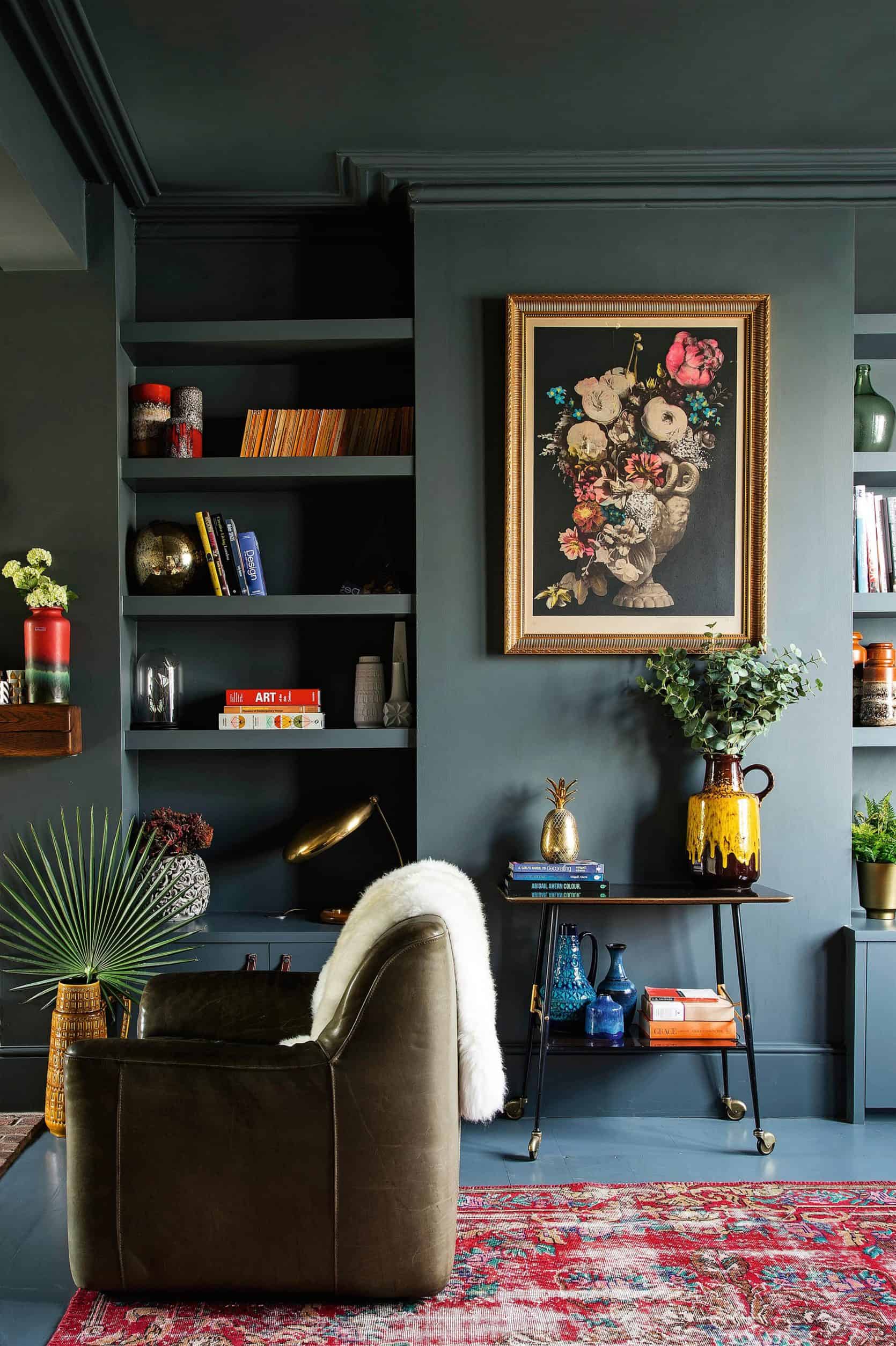
Remember that time that I wrote all about how much white walls are only for insanely boring people with no taste/personality? Okay, that’s not what I wrote, exactly, and I definitely do not agree with that statement. Interesting people can have white walls, too! In fact, I ::gasp:: might even paint my living room walls white (I know, I know, I’m a total and utter hypocrite), BUT let me explain. I have one of those long sort of narrow living rooms (a “before” post for that room is coming atcha in the new year, promise) that leads directly into a formal dining room, with a big dramatic arch separating both spaces. I love that front portion of my apartment because it’s very LA in that it’s a building from the 1920s full of original architectural details…and SO not South Florida (where I moved here from—a land devoid of any architectural interest unless you live in very specific areas—or have a certain income).
In that same if-you-like-white-walls-you’re-stodgy-and-stale post, I shared this photo from Dabito of Old Brand New that showed his BRIGHT YELLOW dining room walls through an arch from his white-walled living room and I was just so taken with that. It made the power of his paint choice so much more potent. I mean, if you’re about slathering a room in a saturated goldenrod hue, isn’t that the point? To make a statement? This got my gears turning for my own home…what if I went a similar route? Subtle and neutral in my living room, then POW IN YOUR FACE paint on the walls and ceiling of my dining room? The way the floor plan is set up, I feel like that room would be a magnet, drawing you in like a siren song through my lounge area. Yes, this could work.
While I battled with my false color virtues (was I really considering white after my “modern maximalist” sermon/plea?), I eventually got over myself and started digging through Instagram for inspirations, including rooms that I had already saved in the past. Very quickly, I realized a trend in my own bookmarked images as well as new finds: hunter green walls were a “thing.” For anyone rolling their eyes right now and haughtily saying to themselves this is not a new idea, you’re right but relax. No, dark green walls (with blue undertones) weren’t invented in 2018. I started seeing them creep up in the design zeitgeist about two years ago (in fact, I thought a similar shade was going to be the Pantone Color of the Year in 2017 before “Greenery”—an almost [radioactive] lettuce-like green—was announced), but it was a kind of a here-and-there thing.
White, blush and gray still reigned supreme, but I think the tide has shifted, and I’m saying it…green walls are the new white walls. Everyone from Leanne Ford—who designed the dining room in the lead of this post for her sister—to Sara Ruffin Costello (a personal style hero of mine) is nose-deep in the dark green walls book and I’m pounding on the door of that book club because I want in. Less because it’s “trendy” (I really hate that word) and more because it evokes the feeling I really want in my home: warm, welcoming, a little dramatic, and a little old world.
OKAY, ready to take a look at some of the rooms that are inspiring me/I hope will inspire you to shake things up if you’re on the hunt for something new? Let’s do this.

There is so much to love about this lounge/bar area in the Hotel Monte Cristo Paris. The floors. The rugs. THAT FRINGE. The delft-like tilework. Oh, and of course, that sexy, sexy green on the paneling. The fact that the color goes only about 3/4 up the wall keeps things light and airy (especially because some of the decor elements are much heavier here).

This shade of green does particularly well in rooms where sunlight washes into the space, missing some corners to create this mysterious vibe that I’m not hating in the least. Pale or well-worn wood tones play particularly well against this (as do speckled and aged ceramics…it’s that whole this-could-also-work-in-an-English-castle thing I always attempt to create in my homes, but then never actually do it and it ends up looking like a Crate & Barrel catalog…).

I tend to be drawn to the bluer of the dark greens, but this hue here is a little warmer (which I think works with the warmer tones of the wood chairs and farmhouse table). That is not to say a cooler shade would be a mistake, but it does feel a little more effortless…almost like both that wall and the dining set up have lived together for centuries.
There’s something about this deep, chalky green that BEGS to be smeared on EVERY surface. Choosing to paint your floors, baseboards, crown molding, built-ins and ceiling in the same moody hue is BOLD, but it’s one of those moves that seriously pays off. It’s like a scratch off lotto ticket you know will always win you $100,000 a year for life.

Here is an image I saved on my own Instagram and then reshared. In addition to the super punchy and color-block palette, I was drawn to the paint application on the ceiling, which is what I’m thinking of doing in my own dining room. It feels like the room is hugging you and a full “thought.” I don’t necessarily dislike a dark wall with white overhead, but it jolts the eye, for sure. If your ceilings are on the lower side and you don’t get a ton of light, maybe stick with white so things don’t feel super heavy, but should gorgeous natural light stream through your windows and you have some height to your room, I say go for the full-color room hug.

So here’s a room by the lovely Jenny Komenda of Juniper Studio (and owner of one of our favorite online art resources, Jenny’s Print Shop), that has a green wall sandwiched between a bright white baseboard and ceiling but it works so well because of the natural light. If the room were darker, the white might have ended up looking possibly dingy.

Oh god, now I’m a goner. Death by design envy. Stop reading what I’m saying right now (well, in 4 seconds when I finish my sentence) and just look at the ceilings here and those herringbone floors. The furniture is definitely…eclectic, but honestly, a plastic crate of paperclips would look artful in a space with this architecture. The dark wall color is what initially draws my eye, which then follows it up and down to ogle the dreamy woodwork.

We recently revealed a house tour from Erin Francois of Francois et Moi and her bedroom wall color selection was on point (for anyone wondering, this is Brooklyn by Behr).

To be honest, I’m not sure if this is actually dark green…maybe it’s a super inky blue, or maybe even charcoal, but the way the light hits it right around that dropped molding is just the feel I’m loving.

The guys are Consort know how to work a dramatic color, and while, again, the lighting in here is tricking my eye and I’m not entirely sure if this is green or blue, it’s a great example of leaning into the darker tones (like in the window shade and furniture) to create a rich, luxe space. I think when people go with a deep wall color, they feel more comfortable layering in brighter, contrast-y decor and furniture (white) as to not get too “cave-like,” but check your fear at the door people, because this is so beautiful, don’t you think?

Both of these images (above and below) are by the insanely talented Sara Ruffin Costello (of Domino fame if you’re an OG Domino fan). She has a knack for creating interiors that feel like they’ve been around for about two centuries that somehow got transported to present day and a super cool person moved in and added just a sprinkling of their modern-day belongings. ANYHOW, while this story is about dark green walls being trendy, I had to point out the genius technique of creating a GIANT faux baseboard. I mean, is there a possibility that this is actually a full baseboard that’s what I’m guessing is about 12 inches tall? Yes, but likely, it’s a standard rounded little baseboard common to older (not-so-grand) homes with an added molding/chair rail type piece, and then that, the baseboard and the wall space in between are all painted the same color to fake the look of a taaaalllll baseboard. GENIUS (quick note: I wouldn’t try this in a room with standard-height ceilings, let alone lower ceilings. This would really only work in a space with soaring ceilings).

Okay, back to green…I’ve been stuck in a place where I’m not sure what color curtains to put against my maybe-soon-to-be dark green dining room walls. I originally thought white linen or even more of a creamy bone linen drapery might be too shocking…too much of a contrast, but after seeing the juxtaposition of the canopy panels in Sara Ruffin Costello’s bedroom, I’m thinking it could work…and in fact be exactly what I’d want (I could also go rogue and do a tone-on-tone curtain, but I’m still chewing on all my options…).

SO…I’m dying to hear from you about what you think? Did I convince you to buy a ticket for the green-wall trend train? Which rooms do you think it works best in? And even more important (selfishly), I want to know…should I bite the bullet and go with a dark green in my dining room?? Of course, it might be hard for you to weigh in being that you’ve never actually seen my dining room, but let’s pretend you can imagine it perfectly based on my description from earlier on in the post…yay or nay on the dark green?
Let’s hear it! And while I have a few paint colors in mind, anyone have a color they’ved used and love? Sharing is caring!


I’m nuts over these deep green walls! My small bathroom is painted deep moody green and I also slathered it all over my nearly-windowless basement. The Benjamin Moore guy thought I was crazy when I told him where I was putting it, but I think it looks great. I call it Freud’s Man Cave. I think it looks smart;).
It sounds awesome! The amount of “pros” I’ve had look at me like I’m crazy in my time…
Oh yes! I’ve got grey green in a bedroom, smokey green in a bathroom, blue green in a living room, black green at a commercial job…I didn’t even think I liked green until I did a tally up! It has snuck into my life over the last six years and brings such depth and warmth to our home.
Wanting to paint my small office in my basement a moody green. Also, I’m a Benjamin Moore fan! Would love to know the name of the green color you chose?
I love my deep green tiny windowless powder room. Everyone thought I was crazy but they like it too!
YUP. YES. 100% IN.
Contractors are renovating my tiny bathroom as we speak and I’m painting it a dark green-ish. (With vertical paneling! Thanks for the inspo EHD.) I was debating painting the ceiling green too, as it’s slanted and low. Would painting it dark be suffocating or dramatic/a statement? Natural light is mediocre… lots of white tile in the shower and on the floor. Fellow EHD readers, help!
I wish I could help! I’m considering painting my bedroom dark (greenish/blue?) because it has very little natural light and seems dingy right now. But I don’t know if ceilings should be white or dark too, because they are low (slightly less than 8ft). I am so terrified of turning the room into a dungeon 😀
When you said ‘white tile in the shower & on the floor,’ that sold it for me – I think you should paint the ceiling green too.
If you want to paint the ceiling the same color but are worried about bringing the ceiling down too much, I can recommend getting the same color but at 50-75%. I did this in a bedroom I was painting blue-gray. I wanted to paint the ceiling the same color to create that enveloped cozy feeling, but because the ceilings were low and slanted, I was afraid it would bring them down too much. I diluted the color and it’s perfect. Due to the angle, you can hardly even tell it’s lighter but it keeps it from feeling too heavy. I’m not sure if this would work with other colors but it’s something I’d definitely try again because it worked so well last time.
Thank you, everyone!! Now that the paneling and tiles are in, I’m leaning towards a white ceiling… but will keep you posted. Ha!
Last year we painted our master bedroom (ceiling and walls) in Retreat by Sherwin Williams and we LOVE it. So cozy! Our Kitchen cabinets were painted Kitty Gray by Benjamin Moore this spring and we fell head over heels for the moody is it gray/green/blue hue! So in love with this style
SW Retreat is the best color. Sometimes green, sometimes blue, sometimes gray depending on the light and angle. For me it was love at first site.
I love all of these. What would take this post to the next level is actual paint colors that would achieve these looks.
I completely agree!!!!
Please give a few dark green paint colors (I especially love the ones with blue undertones too).
100% agreed!
I also 100% agree! It’s on the list to do the next time we do a color trend like this. Thank you for the suggestion!
I’m on board! And definitely paint your dining room. I can visualize this color working well in all the spaces. Great post – thanks!
OMG. My SIL texted me on Fri asking about paint colors and I said (AND I QUOTE), “I’m really drawn to the deep greenish-black shades… I feel like it is the ‘new’ navy.” ARLYN ARE YOU SPYING ON ME?!
As far as some green colors I love… I used Cosmopolitan Olive on the board and batten in my kids bath (2/3 up the wall)– it is much darker than the sample, which I love, and it is very warm. My kitchen lowers cabinets are Nocturnal Green, which in certain light look deep blue rather than dark green. Jenny Komenda used Bavarian Forest on a guest room years ago and I have loved it ever since. My SIL is thinking about Essex Green, which looks really pretty too.
Definitely spying! HA! I’m going to look up all those colors. Thank you!
Only nitpicking b/c I love Jenny – her last name is Komenda, you guys are missing the N. That first dining room is SO. GOOD. Trying to get the courage to paint our bedroom navy… this post is encouraging!
I’m UGH-ing myself for that mistake. Fixed!
We just painted our bathroom “Jasper” by Sherwin Williams. Partly because that is our son’s name so it felt like a sign but really because the color is GORGEOUS. It’s super dark green, almost black, but so rich and bold. We’ve loved it.
My bedroom is painted a very dark green; it looks almost exactly like the photo of the green dining room with green ceiling and gold rug. It’s Sherwin Williams cascades and I LOVE it against my rich craftsman wood trim. The only thing is the room can be quite dark in the evening/night as the window is on the north and east. But I don’t mind at all. Also –
I normally do not care for wood stained trim (I prefer white) but the color really changed my feelings on this. I think you should do it; especially if you have stained wood trim
I like all of these inspirational photos. The title of this post is a little too click-batey for me, but it’s fine. The constant moving / blinking / present ads are not making this as enjoyable of a read for me as it could have been. I’m fine with there being ads, but I’m seeing six ads in the post if I count the one on the bottom, not to mention the other six things on the side for unrelated EHD content. Maybe it would be fine if they just weren’t moving?
Amazing free content has to be paid for somehow … and that’s advertising. Emily and her team have no control over whether the ads move or not, that’s up to the advertisers. The ads don’t bother me at all, I’d rather have them than pay for content! Keep up the awesome work guys … I’ve been considering a dark green accent wall in my dining room for a while now and you’ve convinced me!
I love dark green everything! However, I recently papered over my dark green guest room. Depending on the shade, it’s hard to modernize a deep green room, especially if you want to incorporate any vintage or off-white pieces. But it does look great with bright whites!
We did just one wall in our master bedroom dark green last year, and I ADORE IT.
What color did you go with??
So true! I painted two clients’ dining rooms deep green last year! And I’m considering painting my own master bedroom a deep, moody olive green!
I’m not going to Emperor’s-new-clothes this but yuck! These colors are called moody because they put me in a bad mood! Unless you have massive sun-filled windows, tons of white trim/tile, or lots of light fabric elements to buffer the dark do NOT attempt this! You will be repainting in no time. This trend will pass and it’s so hard to go from dark to light. I’m cringing for the room that has ceiling, floors, walls and trim all painted to match! Sorry, give me light and bright any day!
That’s the beauty of design! It’s 100% subjective. I could be all like THIS IS GORGEOUS, and you could be like THIS IS AWFUL, and neither of us are right OR wrong! The great part about paint trends is they aren’t a huge investment in time or money to completely change up a room and feel fresh and “now”. I feel you on the light and bright, but there’s something about light and bright transitioning into dark and moody that just speaks to me!
Arlyn, I just want to give you a round of applause here. You have an incredible ability to respond positively and constructively to negative feedback. This is a rare and important skill in this day and age. I’m inspired and honestly learning a lot from you. Kudos and thank you!!
I personally think small, dark rooms look great in a dark color, but I wouldn’t paint every room in my house like this…if I had a house. Still living in an apartment so I’m not at liberty to paint anything here, and as you say–painting over a dark color is difficult.
I had a basement apartment where the previous tenant had painted the kitchen area a purplish charcoal color. It made the cheap walnut cabinets look so much better. I had another basement apartment where the bathroom was dark purple–it sounds heinous, but it really looked great.
My dining room (and all the molding in there including the crown) is Benjamin Moore Lafayette Green and I LOVE IT! It is a space that can take the saturation because I don’t spend all my time in there and it’s just so darn pretty with brass and wood. Go for it!
Love the almost-neutral blue greens, not feeling the intense emeralds, and I think it looks more modern when the baseboards match the walls. If you’re renting, maybe just do temporary wallpaper?
Our office/piano room is painted Benjamin Moore Dark Pewter, and our main living area is a pale gray (Ben Moore Abalone). We also have an arched entry between the rooms, and the dark room behind the light doorway entrance is beautiful. It’s my favorite view in the house. I painted the office that color about 3 years ago, and the color still excites me. It’s perfect in the right space.
I’d only counter that deep greens are also gorgeous (perhaps counter-intuitively?) in spaces without natural light. I always have clients embrace rather than fight dark spaces with deep lush colors that envelop –
case in point: https://www.instagram.com/p/BYJgKONDKTb/?utm_source=ig_web_button_share_sheet
this windowless alcove off a client’s dining room was transformed by the deep green shade we applied to walls ceiling and baseboard.
Hmmm. While I do love a dark unapologetically moody room, I’m old enough to have registered for deep green and matching maroon towels for my wedding, so I’m going to pass on the reemergence of this trend. Also, having for several years tried to take pictures of people/kids in green walled rooms, and against a heather green couch, I’d caution that the color does not make people look their best…
It’s awesome for the redheads of the world :-). Or at least the right shade is!
I’m totally on board with the trend, but your comments about taking pictures in front of green gives me pause. The wall I have been planning to paint is one I take photos in front of all the time.
Im with you…., I have clients that I am still asking to purge red and green for the sale of their home. It also makes a small room smaller. Although this would bother me least in a powder room.
“No, dark green walls (with blue undertones) weren’t invented in 2018. I started seeing them creep up in the design zeitgeist about two years ago…”
Also, you know, in the 90s. 😉 The prevalent shade might not have been quite as blue based as these are, but it was totally a thing.
Oh I remember. The house I lived in as a little kid had dark green shag carpeting and I’m pretty sure I remember my parent’s bedroom also being the same shade of dark green. Well, technically, this was the late ’80s, so I’d like to think they were ahead of the curve…
hahaha. yep. navy, deep reds, hunter greens – the ‘jewel tones’. i had hunter green towels in the bathroom and aspired to a ‘cranberry’ pottery barn couch. and the chicago antique store where i ogled furniture that i could not afford was ‘vintage pine’. it all seems to be coming back!
Ha! After finally settling on Bancha Green from Farrow and Ball for our living room renovation in the new year, I stumble on this entry about dark green walls. Love them!
We have been vacillating between dark green and dark blue. There are swatches of Narraganset Green (BM) which was too dark, Green Smoke (F&B) is just a bit to gray, Pitch Blue (F&B) looked very purple in our space, Stiffkey blue (F&B) was nice, but we used it in hour last home. Finally, a few weeks ago, I tried a patch of Bancha (F&B) and we fell completely in love… For contrast, I am looking at De Nimes (F&B) for the ceiling.
Dark green is a color I would have never gravitated towards in the past, but it is remarkable how ones taste can shift.
I love it! In my new powder room I did three blue/green semi gloss walls and one wall of white shiplap. Added black and white fixtures and floor tile. It’s my favorite room in the house! I think green is here to stay for awhile. Blue has been such a design staple that I think everyone’s looking for a new cool color to change things up. Great post!
Just remodeled my kitchen and did my cabinets in a moody, mostly dark green, slightly blue hue. I absolutely love it. Paired with grey marble and caramel leather Counter stools, it looks incredible. My palette was inspired by an old fashion green jaguar with chrome accents and leather seating and trunk straps.
https://myntransportblog.files.wordpress.com/2015/03/1950-jaguar-xk120-from-the-ralph-lauren-collection1.jpg?w=840
If before two years ago you never wanted green walls, and now you suddenly do, it’s not because green is some magical color that will evoke everything you want for your home, it’s because of the trend. Or at least because the trend convinced you that green will evoke those things. There’s nothing wrong with this (paint is a great place to embrace trends), but own your love of the trend rather than convincing yourself you’ve discovered something timeless that was just hiding.
I hope/think this is not a trend! I painted my dining room BM Regent Green in 2012 (with mustard linen curtains – I loved it!!), sold that house in 2014, left the country for a few years, then just painted my (new) master the exact same colour because I missed the vibe so much. Check out the Gold Hive’s den – I think she did BM Salamander – very similar but with a touch more green, which I may try for my living room.
Ha, funny you should mention Gold Hive…we have a house tour planned with her for the new year (so totally feeling her fantastic paint choice for her den!).
Using a bold color choice for walls has definitely become more common in recent years. I had a client install one of my large red paintings on their green wall and looked fabulous. Of course, I had to explain the aesthetics of complementary color schemes. 🙂 http://shawnmcnulty.com
This could not have come at a better time. I’ve been contemplating painting one wall in my living room dark green for a few months and finally picked up some paint chips this weekend. I think dark green is sophisticated and cozy all at the same time, which seems like a great combination to me. My partner is worried that it might clash with our red rug, but, like the picture above, I think the combo is going to be great.
I’m feeling really good about the chalky blue-green in my kitchen right now! because of how open the layout of my house is, the color actually continues into the dining room as an accent wall before changing to a really pale blue/grey for the rest of the common areas. I definitely had found some inspo here, but also felt like 1 wrong move and I’d be in 1994!
It’d be great if you’d try to color match some of those photos and suggest specific paint colors! Love your site!
Oh no! I’m finally getting close to the home I’ve dreamed of/planned for for a few years, and I want my bedroom to be green like a turn of the century library. I don’t want it to be trendy, and I don’t want to look like I’m behind the trends in a few years, instead of like me.
I think in the right space with the right colour it could work but if you go one shade off it starts to creep into bad late 80’s early 90’s forest green.
None of these (except maybe the last bedroom photo) do this because the dark green is in a beautiful architectural room. In the average home it might not work so well.
It is just paint though so if you love the idea, try it and if it didn’t turn out it’s easy enough to just repaint 🙂 Nothing ventured nothing gained and it may be wonderful!
Agreed!
I do love the look of these green walls, however, I find green to be incredibly unflattering to the skin of the humans in the room. My master bath had green walls, and it was impossible/pointless to apply makeup in that room. Our dining room was a sage green, and made people’s skin look sickly. I’ve recently repainted. So…be careful with green!
Ohhh that’s an interesting perspective that I didn’t think about!
Yes, especially if there’s a lot of yellow in the green. Yellow and orange are also unflattering to skin. But the bluer greens are very flattering, at least to me. One of my most flattering color in clothes is a dark teal or a dark peacock. They especially make my blue eyes look even bluer.
One color that people always seem to bad mouth is pink. But pink is extremely flattering to skin tones (especially fair skin tones). If you avoid Barbie and Pepto Bismol, it can be a super wall color. It pairs very well with either stained or painted wood, too. Seems the Brits are less prejudiced against pink, because I see pink walls in a lot of UK shelter mags I peruse. And in a grey climate, it’d be so much warmer.
I read an article 3-4 years ago that had a deep green in discussion as the most flattering color for all skin tones. I cannot find it now, but I guess it’s safe to say it depends on the tone of green.
I’m completely sold. But, then, I was sold before!
I really am averse to white or pale beige walls. They scream ‘rental’ to me in a bad way. Plus my eyes are light sensitive, and white walls in a sunny environment can actually be painful to me. Like wear your sunglasses indoors kind of painful.
“It’s that whole this-could-also-work-in-an-English-castle thing I always attempt to create in my homes, but then never actually do it and it ends up looking like a Crate & Barrel catalog…“ is pretty much my home decor life story.
I am 100% on board the dark/moody green walls train. It started in my bedroom and has since expanded to my living room, dining room, and small guest bath. I’ve used Sherwin-Williams Retreat and HGTV Home for Sherwin-Williams Farm to Table and love them both. I don’t have great natural light in my house so they look a bit darker in my house than they might in others.
Love the paint colors, but.
I am tired of the judgement and critical language. Go for inspiration instead! You could have said all of this without the digs at white, and people who like white (yes, my walls are white and I like them). Why make it personal and negative?
Going back to Emily’s style evolution post in October (https://stylebyemilyhenderson.com/blog/style-evolution-going-big-return-og-ehd) articles that cast judgement – and just any kind of judgeiness in design – stops us from trying things that appeal to us.
Again, you could have said all of this without criticizing and calling names. I would love the EH editors (and writers) to keep this in mind. Give inspiration while fostering an environment of creativity.
I’m sorry my views on white came off as critical. Not my intention at all (more just my humor, which I guess didn’t come across!). White rooms can be SO beautiful, and I do love them, but my stance cames from a place of just being ready to see something new and exciting…and exploring what that means! What are people doing that speaks to me (and maybe you guys)?
Should your walls be white, I saw rock them proudly.
I cant see it. This throws me in the ” way back time machine” to the Tuscany decorating days of 2001. Good to know the trend… But wow. I hope we dont have to deal with this extensively in the Real Estate community. Thanks for Keeping us updated all the same! Love your updates.
Right??? Fauxtuscan yuck. Cherry cabinets and dark red walls. I had them and it was just bad.
Imagine showing a house in 10 years. People will be wondering why the house looks straight out of the 70s.
As the owner of a dark green dining room, I say go for it! We have what sounds like a similar architectural situation, but I choose to paint my living room a lighter color, trusty palladian blue.
I am SO on board the green train! I’ve painted all the walls in the main area of our house that we are reno-ing white, but we have gray/green kitchen cabinets, a dark green guest room (salamander by BM), and a gray/green guest bathroom. Love love love. Definitely saving some of these inspo photos! xo
Arlyn, for your living/dining room combo . . . I have an idea. I hear what you’re saying on the pop. I think you could still get the pop if you did a lighter complementary color in the living room. For example, the living room is a blush, and the dining room is a crimson. Or the living room is a light blue and the dining room has moody teal walls. It wouldn’t work with every combination, but it could work with quite a few. The colors aren’t competing – the dining will still have the pow – but the living is a warm up and maybe looks more intentional than white/teal?
Ohh this could be interesting…time to play around in Photoshop!
Oooo I love this idea so much! Arlyn, please do photo shop experiments and report back!
Nope…. this trend of dark green walls is the new 70s. It’s so dark and dreary and dated before it has even begun. Just say no!!!
Dark green is SO tricky as a wall color…an idea for a deep, rich character can turn into a dank, dusty library look so easily! But I’m crazy about the olive-gray wall with the tall baseboard…seem both traditional and VERY modern at the same time!
Another vote to go for the dark green!! About two months ago we painted our guest room Forest Green by Benjamin Moore, and I adore it, We painted two walls and the ceiling, and I may go all in for the remaining two walls.
LOVE these dark green walls. A few summers ago I painted my kids’ bathroom SW Isles of Pine, and this past year I painted my dining room BM Cleveland Green- deep mossy green brown. I painted the chair rail too and love how it looks, although I do love the green DR with the white chair rail in these pics. i say go for it- I’m a big fan.
I love darker walls these days. I recently painted my dining room navy and I am obsessed with it! Almost everyone tried to talk me out of it before we had it painted and now those same people love it.
Shelley
I love these dark green walls, definitely leaning towards the ones with blue undertones.
This is a living room I’ve been drooling over for some time, by Alison at deucecitieshenhouse.com
https://www.deucecitieshenhouse.com/2017/02/refresh-curtains-with-clips.html
I loved dark green walls before it was apparently, now cool to love dark green walls. I dared myself almost 2 years ago to paint our dining room walls a deep teal green. I fell in love, my husband was horrified! Oh yeah, he was at a week-long conference when I decided and did the deed. I’m still in love with them and he kinda likes them. (he’s a cautious guy) I did change the drapes and dining room chair fabric out twice before I found the song I liked the best. It was worth it, I love the room!
I love these dark green walls, especially the ones with blue undertones. This is a space I’ve been drooling over for some time, by Alison at deucecitieshenhouse.com
https://www.deucecitieshenhouse.com/2017/02/refresh-curtains-with-clips.html
I have been similarly drawn images of dark, hunter green interiors. I was convinced I would paint my den green. I put up a few Farrow & Ball color samples and literally had a visceral reaction to the point of wanting to throw up. Who knew a paint color could make you feel that way? I ended up choosing F&B Hague Blue which has a hint of green (the EHD crew knows this well) and the room is everything I imagined & more!
My dining room is SW Jasper (almost black dark green) and it’s incredible. The room has openings on three sides and a wall of windows on the fourth so there’s a lot to break it up and great light. The connecting rooms are all a quiet beige.
Totally support your dark green dining room (and love this look)!
Recently painted my 7 year old son’s room a dark green (Sherman William’s woodland lichen) and I want to put it everywhere now. It’s so soothing!
I’ve always loved the dark green wall, but with more of an olive undertone.
I almost painted my kitchen a deep dark green 3 years ago but the EHD inspo pushed me into navy. I still debate the switch to green. So what I’m saying here is I was 3 years ahead of you goons but I swayed to your Team Blue push. Ha!
I have been looking for a color for one of my boys’ bedrooms and this is exactly the inspiration I needed. I think dark green would be a great color that my 8 yr old won’t outgrow.
Go for the green! Dining rooms are the perfect place for drama.
Ms Henderson,
Love your blog, your encaustic tile patio, your love of antique rugs and Green! I was Martha Stewart student when I was a young bride and didn’t know nothing and Araucana egg green was definitely her love. I so bought a ticket to Martha’s green train when we moved from Seattle to rural Georgia. I painted the master with a geeen I thought Martha would approve and guess what 26 years later it’s still green ?. I have been trying to bite the bullet and paint it white but I’m actually still in love with it especially @ night – it feels so “home”! I feel so safe in it like I’m being hugged. So sorry for the long answer but Yes, but that train ticket to green heaven! It’s only paint LOL.
As a Decorator I’ve been working with darker walls for a number of years now. For me the darker wall surface provide the perfect backdrop / canvas and have enough strength to hold space so that the other decorative elements can shine as well. The challenge to Decorators is that not all the clients will necessarily buy into the concept. Even a dark wall can be a ‘ bold statement’ for some. Something akin to using strong, bold colours – it takes most folk out of their comfort zones. Strange hey!
Yay for dark green! After reading all those ‘modern victorian’ posts, we painted our small bedroom dark green and put a moody floral wallpaper on one wall. We couldn’t go for a full room hug because the ceilings are too low, so they are creamy white. I am so, so happy with the results and my husband has also come around.
Green is dramatic and oldy-worldy but also very tricky. I do like a number of these images from a design perspective.
Would I put the paint on my very own walls? Only those rich, blue-leaning, not quite as saturated tones, like in the Jenny Komenda and Erin Francois bedrooms (with some nice white moldings and ceiling and the right light). I could live with that for years without it feeling dreary or dated.
The rest do feel kinda trendy, depending on the architecture and style of the overall home. That said, I would be curious to see your dining room because of how you described it. I can imagine it working!
As a former home stager, I will say that green walls are quite difficult to work with: the best direction I found to neutralize a green space was lots of white with soft textures, and silver or gold accents.
Yes to some paint chips being included in this type of post!
I LOVE this look… but the paint in almost all of your pictures looks like it’s flat. We had our living room and kitchen professionally painted a flat, dark green-blue color about 10 months ago, using 3 coats and a professional brand with great reviews for their flat paint line. It looks great, but despite the reviews and the painter saying flat paint is much better these days, we can easily see finger smudges, scratches if the occasional coat brushes up against the wall, and a couple chips from who knows what (It’s just me, my spouse, and our two small dogs….I can’t even imagine what it would look like if our nieces/nephews stayed with us hah). It might work in an infrequently used guest bedroom, but hasn’t held up quite the way we were expecting. We tested flat and satin paint, and for much the same reason I like the above pics, the satin was just too shiny. Would welcome a “how-to” on how to get this look in a maintainable, long lasting way, that doesn’t involve repainting every 6 months.
I LOVE this look… but the paint in almost all of your pictures looks like it’s flat. We had our living room and kitchen professionally painted a flat, dark green-blue color about 10 months ago, using 3 coats and a professional brand with great reviews for their flat paint line. It looks great, but despite the reviews and the painter saying flat paint is much better these days, we can easily see finger smudges, scratches if the occasional coat brushes up against the wall, and a couple chips from who knows what. We tested flat and satin paint, and for much the same reason I like the above pics, the satin was just too shiny. Would welcome a “how-to” on how to get this look in a maintainable, long lasting way, that doesn’t involve repainting every 6 months.
I was crossing my fingers for a wallpaper feature somewhere on this post! We’re set on papering a wall in our dining room and right now I’m leaning toward a white paper with a washed-out pattern (other walls are white)… the only thing that could convince me otherwise is this deep, moody, muted green-blue situation. But honestly I haven’t been able to find anything that fits the bill. I can’t even really figure out what to search. Is it green, is it blue, is it both?! I love this look and honestly, who cares if it’s a trend? I think that’s a waste of time to worry about because practically everything we’re designing now will look dated in 20 years! I think very, very few looks are truly “timeless.” I’m down to ride the moody green-blue wave to the end.
I am loving the hunter green era! Personally I do love a nice moody and old-worldly space as much as a light and airy one, and this color even though I felt was old-fashioned, is blowing my mind right now. I do feel though that you would need to have really good natural light coming in for it to make a real statement, and the. It can be moody at night with dramatic artificial lighting.
I think yes on most of these. I’d love to see the emeraldish green color of the last photo and the room with the wood ceiling on the walls if the picture with the bright white high molding near the ceiling. I think that would be beautiful.
I love dark green walls!!! My dining room is dark green and I’m repainting to go even darker!!!
Love!!! I just painted my dining room Lafayette Green by BM paired with a large woodland tapestry from Anthrolpologie over the sideboard and am loving the moodiness.
Funny story, I accidentally painted the guest bedroom in our house a very deep emerald green about 5 years ago.
How do you accidentally paint a room, you ask?
I had picked out a much lighter sage green, but my green must have gotten mixed up with another paint-buyer’s when it was being mixed, so I brought home the wrong one – which was this dark emerald green called Congo by Behr. I was buying 3 different paint colors all on the same day, since we were about to close on our house and I wanted to tackle a few especially heinous rooms on the first weekend before we moved furniture in, and paint looks lighter when wet, so I didn’t start to suspect the mistake until I’d put a coat on all 4 walls. But the color I was trying to cover was neon pink, so I just kept going, thinking the contrast was playing with my eyes. I ran out of my gallon of paint, needed another gallon to do another coat, and now fully understanding the mistake that had been made, decided I’d rather double down on the dark green than start all over with the correct sage green.
The same paint store employee was there when I came back. He looked very nervous, then confused when I asked for more of the “wrong” paint, and was sure to say out loud “Here’s you CONGO, ma’am” when he handed me my paint. I’m guessing the other customer had come back to swap his out for the correct color already. So home I went with my second gallon of the wrong paint color, and I finished the room that evening.
5 years later, I’m 100% certain I like my accidental color more than I would have liked that sage color. The room has 10 foot ceilings and a tall, south facing window, so the color never feels too dark – I’ve even thought that I wish it was a bit darker, a bit less emerald. It also makes the antique, scrolled-wood headboard, footboard, and dresser look more modern and less granny. It might be the happiest design mistake I’ve ever made, and I’m so grateful that my emotionally drained new-home-buyer brain couldn’t handle the thought of starting over the painting process that day.
I say go for it. It is only paint and can re-painted if you don’t like it
!
Our office/guest room is painted entirely Amazon Moss by Benjamin Moore and all of the trim is white. The curtains are a mixed green tropical print from Spoonflower that provides a tone-on-tone effect. I love the overall look and am totally on board with the dark green trend (and hopefully it’s longer lasting than an actual trend).
Dark green walls are my favorite! I just painted the walls in a new apartment SW Roycroft Bottle Green, and I love it. But I do think that these look best with a completely matte finish though. I did this with an eggshell and I don’t think the color looks as good. I used Benjamin Moore’s Bavarian Forest in another apartment years ago, flat finish, and I think it looked much better.
Of course, the day after I painted, I walked into Ikea and half the store was painted dark green! Now I’m annoyed that it’s so trendy.
Love all of these! We painted our dining room SW Riverway which is a dark teal and it looks very similar to several of these photos. As soon as I opened the paint can I wanted to take a bath in it…it is so good. Check out photos at my instagram @basicbluehouse
I have had dark green walls for the last 10 years and it still feels fresh. I have tone on tone curtains with light color floors and low ceilings which is white. Brass accents, mid century modern furniture make it less traditional but so moody! Go for it!
Thank you for including my sitting room (the remodelista image) in your round up. It was actually painted in Farrow and Ball Down Pipe but for some reason it always photographs with a greenish look to it – which I love. I have since painted it in a rich dark chocolate colour but my bathroom is still Down Pipe and I still love this particular shade of grey.
I am having the same dilemma about my living room – after renovating the house it was painted a greige just to get something on the walls. And it’s a lovely greige, but the room is light during the day even though it is our evening room – so I think it could rock a darker colour during the day and then be super cosy and relaxing in the evening on the dark side. I did do our downstairs loo in a dark green – ceiling too, to remove the shapes created by it being under the stairs. It’s a UK brand Mylands, colour is Borough Market. Sometimes it looks more dark teal (really dark teal) and sometimes it looks more dark dark green.