


Photography by Zeke Ruelas
You guys! At long last, my parents’ kitchen is ready to share! You can see more pics of it over on my blog, but I thought it might be fun to use this very personal project as a way of talking a bit about the back and forth that happens between designers and clients. Any designer will tell you, the final project you often see isn’t always exactly what they envisioned at the onset. Which is actually a good thing if you ask me. A home should be a reflection of the people that live in it. It’s a way for them to express themselves, to tell the world who they are and what is important to them.
I thought it would be fun to share some juicy goss here on what I might have done differently if my parents’ freshly renovated space were my kitchen. As I’ve chatted about before, working with family is extremely rewarding. I’ve been able to help my parents get a large, airy dream kitchen they’ve been wanting forever. Like literally my whole life. However, as with any client, there’s compromise. I think my parents’ kitchen came out perfectly for them, but if it were my own home I might have done things a bit differently.
The design process actually went very smoothly. Mostly because my super frugal parents’ mentally processed that they were going to have to spend a lot of money on their kitchen and mostly gave me the freedom to do whatever I wanted because they knew I had to photograph it and make it look great. I think honestly that trying to calm yourself down about the financial aspect of a renovation is one of the best ways to keep the stress level in check. That’s easier said than done, but it’s important to keep in mind that if you are in the position to be renovating or improving your home, it’s likely that you have more than you need and everything else is just icing.
I don’t think we really argued about anything during the process. We did disagree on things, but I tried to really take their preferences into mind and only pushed for things I felt adamant about. After all, it’s their house and it was their money. One thing I find most interesting about being a fully grown human man is how the relationships that develop in families during childhood kinda stay the same forever. Like when I come home, I revert to the same dynamic with my parents and siblings that I had my whole life. I’m the youngest of three, so no one ever took me seriously or thought I could do anything. So my go-to reaction when I don’t get my way is to be really emphatic about what I want and then sulk if I don’t get it. It’s a super mature way to act and I’m super proud of it.

Before we get to the juicy goss about all the things we fought about, a few things. Firstly, a lot of you know this project took FOREVER and cost a lot more than expected. The construction budget ended up being about $150,000 and that doesn’t include the appliances, finishes, fixtures, and furnishings (which I’m estimating would add another $50-$60K if not more). I know it’s kind of gross I’m just throwing these numbers out there but I hate it when I see posts about this kind of thing and people act like it’s cheap and everyone can do it. The type of construction that this project required is expensive and my parents live in an expensive part of the country, so basically nothing was affordable. I’m not saying that to be discouraging. I’m mostly saying it because one of the main complaints I hear from designers is that they constantly get clients who have completely unrealistic expectations for what can be done with how much money. I’M HERE TO SQUASH THOSE MISCONCEPTIONS AND RUIN YOUR DREAMS. (Sorry).
The intro post I wrote here was over a year ago (check it out to see how crazy and different it was before). At the time, we were hoping it would be ready by Christmas 2017. In actuality, it took until May 2018. Which left my parents with no kitchen from August 2017 – May 2018. You can read more about all this drama over on my blog.
A caveat to this whole post is that it’s supposed to be a fun discussion about difference in taste between family members. I love my parents’ kitchen and think it looks AMAZING and is perfect for them and their lifestyle. However, I think it’s fun to hear about the dynamic between client and designer, especially if the designer is a family member. So for me, this discussion is more about talking over the complexity of decision making that goes into a project like this, less about talking negatively about the decisions we actually made. WE LOVE EVERY SINGLE THING IN THE KITCHEN, GOT IT?

Range | Hood | Backsplash Tile (in Crate Lake) | Long Bar Pull Hardware
A quick note about the range. Basically, this whole project started when Bertazzoni approached me about a collaboration. So I knew from the get-go we were going to use their appliances. I’d been itching to renovate my parents’ tiny kitchen since they moved in 2012 so this was a huge blessing. I also knew from the get-go that I wanted to use this gorgeous Heritage Range (it’s the same one Emily used in the Portland kitchen). So the design of the room was based on the range as the centerpiece. Anyway, like I said earlier, you can read more about the specifics of materials and why I chose them on my blog. Now, onto the goss!
5 Things I Would Have Done Differently If This Were My Kitchen…

Fridge (with Master Series Handles) | Cabinet Color | T Pull Hardware | Galley Pull Hardware
1. I would have addressed the awkward space above the cabinets.
I think this is an issue that a lot of designers run into. Basically, what do you do above the cabinets when the ceiling is an irregular shape or is very high? And I don’t claim to have the perfect answer to it. But I have a few ideas. Basically, any room that isn’t a rectangle provides a challenge for figuring out cabinets. There were two areas where we went back and forth on cabinetry and what to do where it met the ceiling. One was over the main set of uppers to the left of the sink, and the other was above the fridge.
Not surprisingly, I had Zeke shy away from these areas when we shot the room so I had to shoot some quick snaps on my phone to show you what I’m talking about:

The space above the upper cabinets doesn’t bother me as much. It’s large enough that it can be accessorized (I got all these beautiful ceramics from Montes Doggett at AmericasMart on a recent buying trip). This space looks more intentional and I like how it meets the corner of the room to create a triangle. More aesthetically pleasing than other floating cabinets I’ve seen. One thing to note is that if you’re doing a kitchen and have uppers like this, you have to make sure (with constant reminders) that the contractor knows you want the top to be flat/filled in. Otherwise, the typical way of finishing a cabinet like this is to use a border around the top that creates a lip. This means anything you display up there would fall behind the lip, which can range from 3″ – 6.” Everyone thought I was crazy for bringing this up over and over and again but it makes a huge difference in being able to see what’s on display up there.

This was the space that bugged me the most. I wanted this cabinet to go all the way to the ceiling or drywall to the top of the cabinet. I fought the contractor and my parents pretty hard on this one but ultimately they used the sublime power of passive aggression to leave it open. I just kept asking them to do it and they just kept not doing it. The reason I don’t like it is that all it does is leave a place for a dark shadow to live. There’s no room up there to put anything, and if you did put something up there, it would look busy and crowded. It’s a useless space that’s now basically just a nice resting place for dust bunnies. If the cabinet went all the way to the ceiling, the light color would bounce light back into the room. Instead, because there’s a dark, cavernous space there, it creates a BLACK HOLE OF NOTHINGNESS above the fridge.

The reason I’m so obsessed with the spaces above the cabinets is that the way you address them makes a huge difference in how custom and personalized the kitchen looks. A cabinet that just looks like a box you stuck onto the wall doesn’t relate as well to the architecture of the space, it’s generic. The cabinets in my parents’ kitchen were custom made for it and were more than $30,000. But because they look like they might have been purchased ready-made and could be plopped into any kitchen, we missed out on an opportunity to give this kitchen a more custom, high-end look.

Dishwasher (with Master Series Handles) | Countertop | Floor Tile (Rustico 6×12 in Clam) | Vase
2. I would have integrated the appliances.
I love the look of this Bertazzoni fridge. But right after we ordered all the appliances, Bertazzoni came out with panel-ready refrigerators and dishwashers. Ormomdo likes the look of the stainless steel accents in the kitchen. She likes that the appliances have a presence and are beautifully designed. But I love an integrated appliance, so I probably would have done these with panels if it were my kitchen.
A downside to a panel-ready refrigerator is that they tend to have less interior space than the French door style Ormomdo and Orlandad got. So, in my opinion, this fridge was still the best choice for them. Though part of me is already itching to update it with one of the gorgeous new panel-ready ones. I guess I love that the panel-ready ones feel kind of secret. Like those bookcases that are actually doors into a secret room. YOU THOUGHT THIS WAS JUST A CUPBOARD BUT JK IT’S TOTALLY A REFRIGERATOR.

Roman Shades (Fabric: Dwell Studio Romaria in Aquatint) | Wall Color | Island Color | Brass Pendants | Globe Pendant | Stools | Tea Kettle
3. I would have used a different hardware for the cabinets under the island bar.
The contractor used a cabinet company (who I won’t name as I DO NOT recommend them because the cabinets took FOREVER and showed up wrong multiple times) who sent a kitchen designer to measure and figure out cabinetry. This was great because I didn’t have to worry about precise measurements, but was annoying because this designer wanted input. Literally too many cooks in the kitchen! The contractor and the designer pressured us to do push-to-open cabinets under the island. You know the type? That you push in then they pop open? My idea here was to do a tapered/angled edge at the top that acted as a pull. The reason being that I’ve seen a lot of these push latch mechanisms fail after repeated use and I was picturing these not having a long life.
However, the most annoying thing about these push latch cabinets is something that I didn’t anticipate (because I’ve never designed an island with outfacing storage) but should have. When you sit in a barstool your feet kick around. And these cabinets are constantly getting kicked (which is why I painted them a dark color). So these cabinets are constantly popping open. They’re always half open, half closed due to them getting kicked so whenever I’m sitting in front of one I’m constantly pushing them back in. LET THIS BE A LESSON TO ALL OF US NOT TO USE PUSH-TO-OPEN CABINET HARDWARE ON OUR UNDER ISLAND BAR CABINETS. Let this also be a lesson not to be oppressed by contractors and fancy kitchen designers, forced to do stuff your heart KNOWS is wrong! STAND UP FOR YOUR RIGHTS! RESIST!


Entertainment Faucet | Small Sink | Wine Fridge (similar)
4. I would have made the prep sink a pull-down.
Originally when we were configuring the kitchen, I designed the sink the island as a bar sink where my parents’ filtered water would come out. However, in the course of designing the kitchen, Ormomdo wanted to move the filtered water to the main sink and give it its own faucet so they weren’t wasting filtered water doing dishes (a very Ormomdo concern tbh). We’d already ordered these beautiful Kallista faucets months before they were installed so we just installed the original fixtures we chose. But now when we’re all around cooking and cleaning, it would be very helpful to have the flexibility of a pull-down faucet that moves side to side (also makes sink clean up easier). I love the design of this faucet, but it’s more appropriate for a beverage sink, which is how it’s intended to be used.
In more important news, I tried my VERY BEST to convince my parents to go brass, because the brass version of this faucet is truly a thing of beauty. But they didn’t go for it. It wasn’t that they didn’t like the brass, it was more that they were worried it would show water residue more readily than the beautiful brushed nickel version they selected. I didn’t fight them too hard on this because part of me wanted to show a non-brass faucets suite. It feels like all of us bloggers/Instagrammers (myself included) have been doing ONLY BRASS for so long so I kind of wanted to show another finish. That being said, look at how gorgeous the brass version of this faucets is:


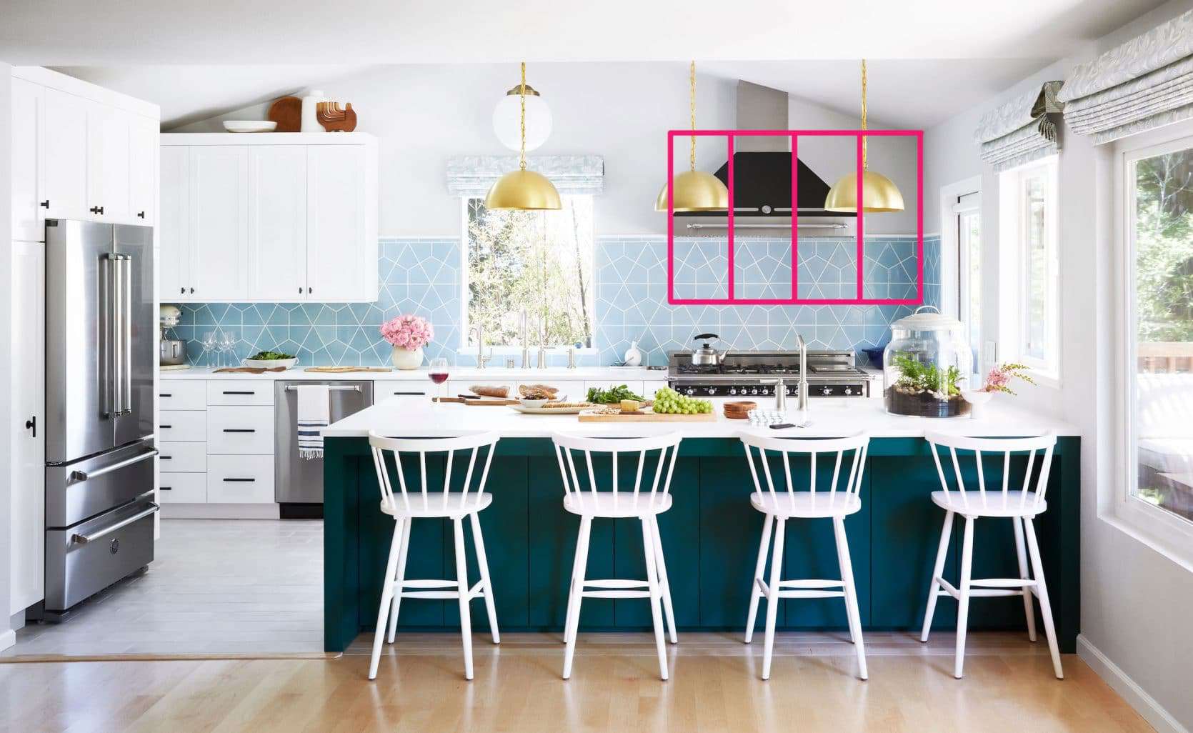
5. I would have added more upper cabinets.
The second Ormomdo saw the beautiful Bertazzoni hood, she fell in love with it. And I love it, too. Along with the range, it’s the centerpiece of the room. In fact, I kept the design of the kitchen simple in order to let the ornate details on that range truly sing. However, one of my main objectives with this kitchen was to increase the storage (which is also why we did a connected peninsula and not an island with less storage). So while I LOVE the beautiful hood, I might have preferred to add cabinetry with an integrated hood if this were my kitchen. Bertazzoni has a big selection of those, so that was definitely an option here. Ormomdo’s argument against it was that the exhaust systems tend to take up much of the interior space of the cabinets so they’re not super useful. Also, the cabinet height would have to be raised to be an appropriate height above the range, so there’s a loss of storage space there too. I think I just like the idea of having the room be more symmetrical, though I like the asymmetry as well.

It’s really hard to believe how different the kitchen is now that it was when my parents moved in. The whole room feels like a totally different space. Before, activity was kind of segmented around the house. There wasn’t really a central space for everyone to hang out in, just a bunch of giant stupid living rooms to sit in alone and cry about the past. But now the kitchen and family room are a much more functional, dynamic place to be in. There’s literally no need to cry anymore!

Large Sink | Pull-down Faucet | Soap Pump | Filtered Water Faucet

Cutting Boards (similar) | Cheese Board (similar) | Sea Glass Tumblers
My parents are very into their new kitchen. Just look at them there happily chopping while I pretend to stir a very delicious sauce we’ll all eat as a happy family around the dinner table (or casually laughing at the peninsula KICKING OUR FEET into the push-to-open cabinets). And even though some decisions aren’t ones I would have made for myself, I love the way it turned out, too.
BUT WHAT ABOUT YOU? Does that cabinet gap drive you as nuts as it does me or is it totally fine? Anyone have any solutions to those annoying pop-open cabinets once installed? WE WANT TO HEAR FROM YOU. And don’t forget to head to my blog (HAVE I MENTIONED THAT ENOUGH???) to see all the reveal photos and read more about the design process, the whys, whats and hows of the Casa Soria kitchen.
Don’t Miss a Casa Soria Reveal:
- Mixing Old & New in the Casa Soria Dining Room
- A Dark, Depressing Room Becomes a Bright Spot at Casa Soria
- Orlando’s Parents’ Deck is Done!
- Creating a Big Impact Without Making Any Permanent Changes (Bedroom Reveal)


The cabinet gap above the fridge would also drive me nuts and i would probably make every change you suggested. That blue tile is beautiful in here against the darker peninsula and the space feels so happy and bright! I feel like the styling is off though, it seems distracting, especially knowing the insane beauty and styling you pulled off at orcondo. I say this only because you have so many times wowwed me with your interiors. Thanks for sharing the ups and downs 🙂
Ps. The link is in the title and the link to orlandos blog leads to nowhere and i cant find the post on his site.
Orlando is my favorite writer. Forever. Some of my favorite gems today:
1. “when I don’t get my way is to be really emphatic about what I want and then sulk if I don’t get it. It’s a super mature way to act and I’m super proud of it.”
2. “a bunch of giant stupid living rooms to sit in alone and cry about the past.”
Okay, about the kitchen. I LOVE LOVE LOVE it. i’m so happy to see some color in there. blue tile. teal peninsula. yay! so many white kitchens everywhere. even though the cabinets are white, it’s not blinding in there. also, totally agree about the push-to-open doors. i never trust those things. blah. i’m all about the manual openers. and agree about the space above the fridge. the other triangle space looks nice with stuff up there to style it. i’m with ormomdo about not wanting to waste filtered water on dishes. i’m very resource-conservative, and that would totally occur to me. this kitchen is so great. nice job!
Yes to Orlando being my favorite writer! Dying over the stupid living rooms comment!! Also – great kitchen 🙂
I agree, Orlando is hilarious! I love reading his posts. And the kitchen looks great, I especially love that beautiful blue tile.
That kitchen is gorgeous.
The space above the cabinets and the pop open doors would bug me, too. But seeing the appliances doesn’t bother me at all. In fact, I like how it adds another texture and color. I’m not really getting the integrated appliance thing, tbh. I like seeing the functionality of things. This is a working kitchen and that is beautiful to me.
And your mom is right about the hood. It’s stunning. Symmetry is overrated! This is much more interesting.
I’m with you on integrated appliances. I love stainless steel! Who needs a wall of cabinets?! This is a gorgeous kitchen and the information in this post was so helpful as I dream about the possibility of someday designing a kitchen!
It looks amazing, congrats! The backsplash tile and fabric on the romans is the perfect combination—those blues just sing! Loving those appliances, too.
What is the shade that you used on the door? I didn’t see it sourced, but maybe I missed it. (I know that’s literally the most boring aspect of this awesome space, but I am trying to find something similarly minimal for my own kitchen.)
Did you photoshop in the cutting boards with the lettuce and the pizza?? And whatever is in the oven?
nope, the cabinets look great. The great expanse of filler required to meet the ceiling would bother me, and then the range hood on the right would feel off to me-I love the asymmetry but it feels balanced. Your parents are in a wonderful stage of life where they dont need a gazillion cabinets filled with stuff, and I can’t wait to get there! As soon as my kids leave for college, I’m ripping out my kitchen, getting rid of the uppers and let the light in! Sorry kids, bring your own plate and bowl when you come home to visit 🙂
I will start by saying this: OMG YOUR MOM HAS THE MOST BEAUTIFUL HAIR EVER!
Also, I totally get the gap on top of the cupboard, it drives me insane as well!
Apart from that, what an amazing kitchen. Love, love, love that tile on the back splash. And those gold pendants? So pretty!
You have a lot of talent, Orlando!
I’m so obsessed with this kitchen, Orlando! Do mine next pleeease! Except I don’t have 150k for renovations so maybe not. I appreciate the frank honesty about the cost of these types of projects though!
agreed! i really appreciate the transparency about costs. we’ve been watching HGTV and thinking it’s just $30k to renovate a kitchen and are shocked at the real costs! love you, orlando!
please oh please oh please, can you get your mom’s input on her sink & stove location?! We have a kitchen reno in our future, and our stove and sink need to be configured just like that, and i’m so worried that i’ll feel limited in prep space! But, if a practical, experienced real-life person who cooks real-life food could give me a word of encouragement, it’d be so helpful! Also, is the distance between lower cabinets and peninsula the standard 36″ or more or less? I’m totally mooching info b/c this kitchen is really similar in layout to where we think we’re headed with ours.
JB,
I was worried that the space around the stove top would limit my prep space but I find myself prepping at the peninsula. Then the space around the stove top is fine for whatever I have to have there. That issue might also be mitigated by the size of the stove top–I can put stuff on the covered griddle space if I need to. The distance between the counter and the peninsula is 50 inches. I thought that would be too wide to make a good working triangle but find it allows two or more people to be working/passing at the same time without crowding. And I don’t mind an extra step or two. This kitchen works really well!
Ormomdo
THANK YOU SO MUCH FOR YOUR INFO!! It’s so appreciated!! ?
Not his mom but I’ve lived in a kitchen where my prep space was an island directly opposite the range (which only had about 1-2′ usable space either side. NEVER AGAIN. I cook virtually every day and it was incredibly annoying to have to pivot every time I want to add something I chopped to a pot, or stir what’s cooking. For the rest of my life I am doing my utmost to have at least 3′ of clear counter directly to the right or left of the range. If the 3′ includes a corner turn, make it 4′ so you still have 2′ width to stand in front of your cutting board.
Julie–Thanks!! I appreciate this info as well! Currently have a tiny corner, so that gives me a good gauge on how much would be ideal if we go this route!
Your dad’s mustache is awesome. That is all.
What a stunning kitchen! I love that it is modern but completely unique and personal. Orlando, you are amazing!
It’s beautiful. That backsplash tile absolutely radiates. Now that I follow Orlando’s Instagram stories I can HEAR him narrating;). Such a “voice.”
I would agree with your changes, except I also like the stainless appliances and the exposed hood. Especially if the exposed hood has more power than one built into a cabinet (as one who cooks a lot of stir fries with spice, and curries…).
My one quibble is actually the rug between the range and the peninsula. Seems you could find something with either more elegance or more spark, know what I mean?
Oh Orlando, this is beautiful! I love the backsplash tiles so much, they are amazing! Also amazing is your writing. You are a national treasure. “…they used the sublime power of passive aggression to leave it open.” Fantastic, thanks for sharing your gifts with the world. 🙂
The space above the fridge didn’t bother me until you pointed out the DARK SHADOW. I now agree that it should go to the ceiling.
The pop-open cabinets sound like a nightmare and I would question why the kitchen designer didn’t already know this!
I would love to hear more about the color scheme, finishes and accessories! I just used that shade fabric in a kitchen and I love it!
I agree with Mom in the range hood vs cabinet debate. In a previous home, we inherited very ornate custom kitchen cabinets and range hood cover. Cleaning the grease off of these was a continual battle. The kitchen in our new home has a stainless range hood and a little open space. This is so much easier to keep clean.
On all other issues I am in agreement with Orlando. Adore Orlando even more for acknowledging that ultimately it is not his kitchen. Orlando posts are fabulous.
Love guest posts from Orlando!!! The kitchen looks amazing!
“One thing I find most interesting about being a fully grown human man is how the relationships that develop in families during childhood kinda stay the same forever.” We are currently planning my grandfather’s 100th birthday party and my dad and his siblings are in their 60s and 70s and they STILL act like they’re all 12. It truly never changes.
Also, can we talk about how chic Ormomdo is? She just seems so cool, and casually elegant.
Thank you for your honesty about how much everything costs. It’s so refreshing and it really does help mitigate expectations! I’m suddenly feeling very content with my 2005 beige kitchen. You’re doing the lord’s work.
Agree on all points, especially about Ormomdo 🙂
Thank you so much for sharing your decision making and thoughtful comments on what your preferences and why.
Looks beautiful and made with love : ) But about those brass faucets… I personally like the mix of metals in this kitchen. Brushed nickel, matte blacks and brass light fixtures (!). If you added brass to the faucets too, it would have been too much. Personally I know brass looks great in person but photographed it can look too glammy (and not in a good way).
As always, love your writing clever man/boy.
What a lovely, happy, gorgeous kitchen! It has color and light and lots of love. I actually love the gap above the cabinets that are over the dishwasher (great styling up there), but dislike the one over the fridge. The only appliance I’d like covered up is the dishwasher. The color of the peninsula is gorge and I really love the lighting choices. The pendents and the globe feel so good together.
These posts are my favorite!
I lol’d so hard at “I’m the youngest of three, so no one ever took me seriously or thought I could do anything. So my go-to reaction when I don’t get my way is to be really emphatic about what I want and then sulk if I don’t get it. It’s a super mature way to act and I’m super proud of it.”
You should see my husband & his 4 siblings- all totally competent adults w/ important jobs and families of their own- call call their mom at the same time and wine to her when they have a disagreement.
Gorgeous kitchen. I’m allergic to upper cabinets so I love just the beautiful range hood. You can take off the push open mechanism and replace it with anything you want. They are always so irritating.
Love your sense of humor. So important in remodeling a kitchen and in life! Just finished a kitchen remodel and had the same issues you describe with our cabinets. I gave in to that dark shadow above several of them after raising it with my architect/designer. Would have loved to have had you as my advocate in dealing with the cabinet shop and design/build firm that handled our project! Of all the incredible wisdom you’ve imparted here, my favorite advice is: “Let this also be a lesson not to be oppressed by contractors and fancy kitchen designers, forced to do stuff your heart KNOWS is wrong!” Thank you, Orlando. for giving me my new words to live by: “STAND UP FOR YOUR RIGHTS! RESIST!”
My kitchen cabinets have lights on top as well as below. That could make the dark shadow of doom above the fridge less doom-y.
Came here to say same thing. Uplights!
I did not like the space between my upper cabinets and ceiling being a shadow as well. I priced out adding lighting up there and it was very expensive. I told my electrician to put a plug above all my cabinets and wire it to a switch. I just plug in a strip of Christmas lights in the outlet and when I turn on a switch they go on. I have to replace them every few years. But u can’t have a flat top to a cabinet because you need to hide the string of lights.
Ay Orlando!
that is the happiest backsplash tile I have ever seen . It almost dances in the space.
Fantastico job! it was worth the wait
So beautiful! The spaces above the cabinets does not bother me in the slightest, and I don’t think anyone but a designer would notice when they were in the space. Love the appliances–and I wish the light fixtures that are hung above the bar were brushed nickel or whatever the appliances are as it would tie the whole thing together more (not that it really needs it). Brass is so bright and yellowy, it really is a pop of colour!
This kitchen turned out gorgeous and the appliances are stunning. I think your mom was right about those.
I do think the gap above the fridge needs to be closed up. And to my eye the brass chain pendants aren’t quite right… I would rather see something quieter that has the same metal tones as the range hood. Eh, you do you.
Turned out beautifully and your family is adorable.
Love this kitchen! It is gorgeous. Beautiful tile, love the layout and all the different colors. And I don’t like integrated appliances because then your guests are hunting around for the fridge. So I probably wouldn’t change anything except for your island hardware problem –and I might have kept the wood tall chairs for the island that you had in your original photo because I like contrast. But it is a fantasy kitchen —what a nice thing to do for your family Orlando!
It’s so clean! And VIBRANT all at the same time! Wonderful color matching.
Where is the microwave?
I know your Mom loves Japanese items and the tile reminds me of a piece of origami paper with all the preparation folds. Lovely.
I read the entire thing but my biggest takeaway was that you referred to your mom and dad as Ormomdo and Orlandad….I’m obv a fan of these nicknames and hope you put this on their Christmas gift tags.
1. Your dad’s mustache! AH-mazing!
2. I can so see why you and Emily are close. The blue tile screams Emily Henderson to me.
3. Love the writing – as everyone else does.
4. And yes thank you for being super transparent on costs (and timeline – holy crap).
I have a few thoughts on this post…
1) I would have appreciated a positive reveal that focuses on all of the great things about this kitchen and not all of the things Orlando would have done differently! Since you would never (should never) do this with a client space, I guess this is a benefit of working with family…
2) I don’t love the tile. Seems bright and modern for what the other spaces have looked like. (Which I love.)
3) All pull down faucets, only!
4) Without the construction costs involved in literally expanding the house, wondering what the costs would look like…
The window picture just made me think “Oh, romaine and avocado, two things I can’t get right now!” and then realized a $200k kitchen isn’t in the cards, either.
It looks amazing! Quite a difference. The things that bug me about my kitchen remodel didn’t reveal them selves until AFTER I live with it for a few years. BUT, every time I walk in my kitchen makes me smile! Love looking at your pics!
It’s absolutely gorgeous! I love reading posts from Orlanda! Always funny/enjoyable! Design is always so lovely! And I always learn something too!
Thank you for this post… I love learning and thinking about what I should have done differently. I actually like the way the triangular space plays with the angular shape of the hood and the tiles. However I would also have preferred that the rectangular space filled. Beautiful job!
I love the kitchen AND I agree with all Orlando’s comments.
I HATE the cabinet gap! I agree that the sink/stove wall gaps are o.k. (and you have cool design pieces there), but the fridge gap kills me. I would have insisted on it being blocked off as you wanted.
The stove is killer.
Can I say how grateful I am that you’re being honest about the budget issues??? I don’t know how those HGTV shows come up with their dollar amounts, but they’re always way low. I know because lots of their shows are in L.A., and I KNOW what costs are here, sadly.
This is really beautiful Orlando. Nice work. I guess you just showed your family you really can do stuff!
Such a happy, beautiful kitchen! And I love hearing from Orlando! His book on my Christmas list. Fingers crossed Santa brings it this year!
My parents totally did the cabinet gap with their kitchen renovation. The only reason it drives me crazy though is because they moved out and I moved in. It’s now my kitchen and the only thing I can use that gap for is Christmas lights 3 weeks of the year.
Nice post on compromise.
The cabinet gap above the fridge DRIVES ME NUTS. OMG. If I somehow took up residence in this beautiful kitchen, closing the gap would be the first thing I would do. Looking into that shadow is like looking into the deep dark depths of my soul!
Vivienne + Orlando = TLA
You are SO charming and funny! I laughed so hard about the living rooms to cry in!
Love the blue tile, love the clean look of everything, like the fridge as it is, in a working kitchen. I would hate the weird dark ceiling triangles, and in my home, they would end up very dusty and gross. They look like something was forgotten until it was too late, to me. The silly peninsula hardware is just too bad. As for more cabinets, I would definitely need/want more, but the hood is wonderful–hard to choose which is more important! And I also greatly appreciate hearing the financial aspect of the renovation–reality!
Hope I didn’t overlook the answer, but could you share what those floor tiles are? Thank you! Loooove the kitchen, awesome work.
Oh my gosh!! I loved this post, because I saw these photos today and absolutely LOVED this kitchen and the backsplash tile that you carried up above the bottom of the wall cabinets. But wondered why the cabinets weren’t carried up higher?! As a kitchen designer it is a pet peeve of mine but I have many clients that decide otherwise and it drives me crazy. I have also had that issues with the push latch hinges (because people want the back of the island to just look like finished panels) but find small knobs to be inconspicuous and work just as well, if not better! Plus, how often do you need to access those cabinets anyways? Anyways, love the space and love this post!!
I have been undecided on whether to use a designer for my kitchen. The main reasons I would want to do so are so they can touch up my ideas and to be free of all the hassle. This post has pretty much convinced me not to go with a designer. The space above the fridge is absurd. Even crappy identical homes that cost half the price of this redo have their cabinets hung correctly. If i ever ran into such an idiot cabinet maker, handling the hassle of getting it right is something I would expect the designer to do. And those popping-open doors being kicked is obvious. I predicted it as soon as he mentioned them. And a designer couldn’t foresee that/didn’t have the argumentative skills to get something different? Again, absurd. I guess if your kid is doing it for you as a gift, you accept it along with the ornament they made you in second grade, where that one part keeps folding over, but there is absolutely no way I can see paying for someone to do this, and then blame on being a wimp.
There is a difference between constructive criticism, and bashing someone’s work. In the design world (speaking as a designer myself), constructive critique and feedback is helpful to reflect on projects, and learn new lessons for future projects. However, your feedback is not constructive, and resorts to name-calling. Please remember that you are talking about real people, and that projects are complex problems that don’t have one perfect solution or answer. Maybe you’ll remember this the next time you decide to call someone’s work “absurd” or calling someone an “idiot”.
And all the designers breathed a collective sigh of relief that newjen would NOT be calling them.